Colour combinations
What colours go with turquoise
This is your palette
Turquoise is the colour of clear sea water, and it needs a clear colouring to match. In our palettes it belongs to the Springs and to Bright Winter: True Spring’s clear turquoise, Light Spring’s spring turquoise, Bright Spring’s bright aqua and Bright Winter’s vivid turquoise. Light Summer wears a softer sea green, and Soft and True Autumn a turquoise dulled towards teal and verdigris. The deep and cool palettes take its darker, bluer cousin instead: pine teal for Deep Winter, cool teal for True Summer, sage teal for Soft Summer, rich teal for Deep Autumn. Below, what to wear with turquoise, palette by palette.
The palettes that carry it, and what to wear it with
True Spring
Your versionClear Turquoise
Wear it with
- Ivory Silk
- Espresso Bean
- Golden Poppy
- True Marigold
Light Spring
Your versionSpring Turquoise
Wear it with
- Warm Ivory
- Cocoa Bark
- Peach Bloom
- Warm Apricot
Bright Spring
Your versionAqua Bright
Wear it with
- Bright Ivory
- Dark Chocolate
- Vivid Coral
- Clear Warm Red
Bright Winter
Your versionVivid Turquoise
Wear it with
- Optic White
- True Black
- Clear Cerulean
- Royal Blue
Light Summer
Your versionSea Green Soft
Wear it with
- Soft White
- Charcoal Slate
- Soft Powder Blue
- Periwinkle
True Autumn
Your versionSoft Verdigris
Wear it with
- Warm Ivory Cream
- Dark Warm Brown
- Burnt Sienna
- Warm Rust
Soft Autumn
Your versionMuted Teal
Wear it with
- Warm Oyster White
- Dark Cocoa
- Warm Terracotta
- Soft Ochre
Pieces in these colours
Affiliate link · the price is the same for you
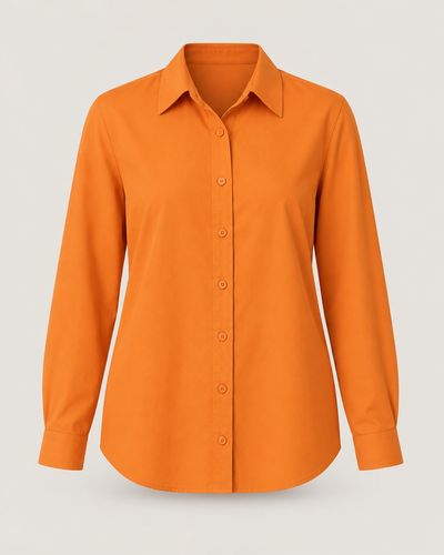 ShirtGolden PoppyAmazon ↗
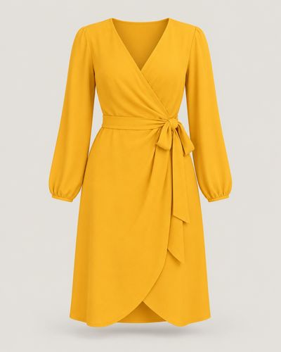 DressTrue MarigoldAmazon ↗
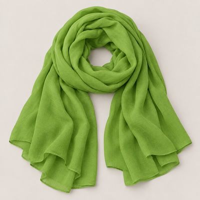 ScarfGrass GreenAmazon ↗
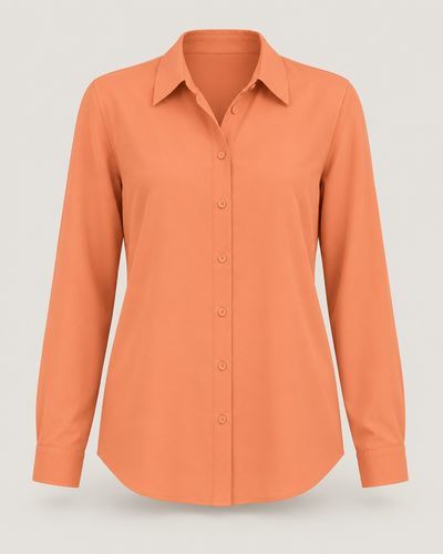 ShirtPeach BloomAmazon ↗
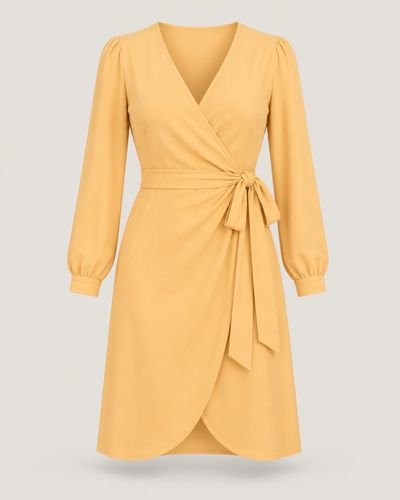 DressWarm ApricotAmazon ↗
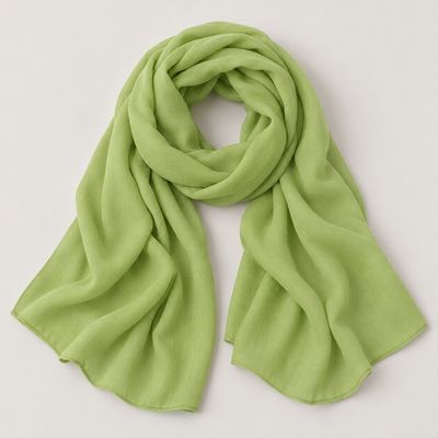 ScarfFresh LeafAmazon ↗
The photo shows the colour and the cut, not the product the search finds.
Tips
- Turquoise and coral sit almost opposite each other on the colour wheel – the classic summer pair. True Spring wears clear turquoise with melon sorbet or golden poppy; Light Spring spring turquoise with peach bloom; Bright Spring bright aqua with papaya or vivid coral.
- Turquoise and white is the freshest pair there is – choose the white your palette wears. Bright Winter puts vivid turquoise next to optic white; Bright Spring bright aqua next to bright ivory; Light Summer its soft sea green next to soft white.
- Turquoise with navy or a deeper blue looks polished and calm. Bright Winter pairs vivid turquoise with a deep true navy or royal blue; True Spring clear turquoise with a deep marine navy or warm cornflower; Light Spring spring turquoise with marine navy.
- For a bold, cool look, put turquoise next to pink. Bright Winter wears vivid turquoise with hot cerise; Bright Spring bright aqua with watermelon pink; Light Summer soft sea green with rose petal or blush rose.
- The Autumns wear turquoise softened towards teal, and it loves their warm earth colours. Soft Autumn pairs muted teal with warm terracotta, camel or apricot clay; True Autumn soft verdigris with warm rust, camel bronze or golden ochre; Deep Autumn rich teal with mahogany or burnished gold.
- Not sure turquoise is yours? In daylight, hold a clear turquoise and then a darker, bluer teal under your chin. If the turquoise makes your eyes sparkle, it is yours. If it looks loud and your skin looks pale next to it while the teal looks rich, the teal is your version.
How to find your palette
Colour analysis reads three things in your colouring: warm or cool, light or deep, clear or soft. The quiz asks about your eyes, hair and skin, looked at in a mirror by a window in daylight. It never photographs or scans your face, and the palette it finds is yours to keep.