Colour combinations
What colours go with red
This is your palette
A clear, strong red sits right on the line between warm and cool. In our palettes two carry it: Bright Spring wears it warm, with a touch of orange, and True Winter wears it as a cherry red with a hint of blue. Light Summer keeps tomato red away from the face: a red this strong and warm overpowers its light, cool colouring. The other palettes wear red’s neighbours instead – peach and melon for Light and True Spring, terracotta, rust and mahogany for the Autumns, raspberry and dusty rose for the Summers, cerise for Bright Winter, cranberry or black cherry for Deep Winter. Below, the two palettes’ reds and what to wear with them.
The palettes that carry it, and what to wear it with
Bright Spring
Your versionClear Warm Red
Wear it with
- Bright Ivory
- Dark Chocolate
- Vivid Coral
- Bright Golden Yellow
True Winter
Your versionCherry Red
Wear it with
- Pure White
- Jet Black
- True Blue
- Cool Cobalt
Harder near the face for
For these palettes it fights the face. Lower down, or as a small accent, it can still work.
Pieces in these colours
Affiliate link · the price is the same for you
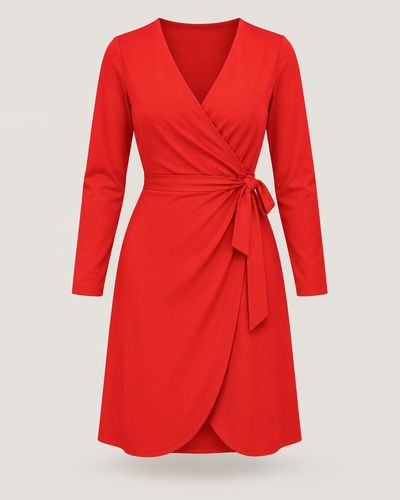 DressClear Warm RedAmazon ↗
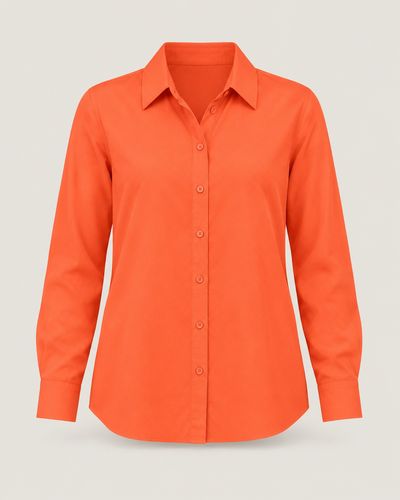 ShirtVivid CoralAmazon ↗
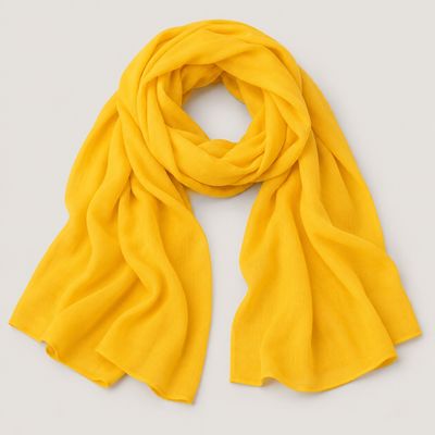 ScarfBright Golden YellowAmazon ↗
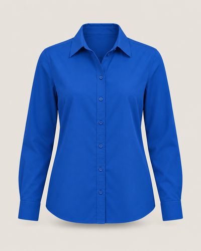 ShirtTrue BlueAmazon ↗
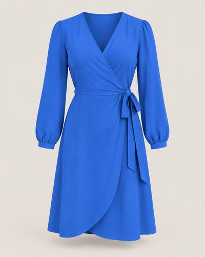 DressCool CobaltAmazon ↗
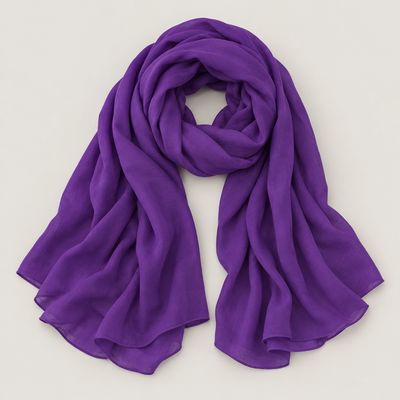 ScarfRoyal PurpleAmazon ↗
The photo shows the colour and the cut, not the product the search finds.
Tips
- Red with white looks crisp; red with black looks bold and graphic – that is the True Winter pairing. Bright Spring gets the same contrast, warmer, with ivory and dark chocolate.
- Red and blue are the classic pair. Navy calms red down and makes it easy to wear; cobalt or a true blue next to cherry red is the bolder, True Winter way.
- A neutral lets red lead the outfit: grey with the cool cherry red, camel or a warm beige with the warm red. One red piece and the rest neutral is enough.
- For a brighter look, stay inside your palette: Bright Spring’s red with coral or golden yellow, True Winter’s cherry red with royal purple or a deep emerald.
- Not sure which red is yours? Hold a tomato red and a cherry red under your chin in daylight. Yours is the one that makes your skin look clear, not flushed or sallow.
- If red is hard near your face, wear it lower down – trousers, a skirt, shoes, a bag – or take your palette’s own version of it: raspberry, terracotta or rust.
How to find your palette
Colour analysis reads three things in your colouring: warm or cool, light or deep, clear or soft. The quiz asks about your eyes, hair and skin, looked at in a mirror by a window in daylight. It never photographs or scans your face, and the palette it finds is yours to keep.