Colour combinations
What colours go with coral
This is your palette
Coral sits halfway between pink and orange, and that warm half decides who it suits. In our palettes it belongs to the Springs and to Soft Autumn: Bright Spring’s papaya and vivid coral, Light Spring’s peach bloom, True Spring’s melon sorbet and Soft Autumn’s warm terracotta. The cool palettes find it harder near the face – Light Summer, True Summer and all three Winters – and wear a pink with blue in it instead: soft raspberry, rose petal, hot cerise, magenta. True Autumn and Deep Autumn go deeper, to burnt sienna and brick clay. Below, what to wear with coral, palette by palette.
The palettes that carry it, and what to wear it with
Bright Spring
Your versionPapaya
Wear it with
- Bright Ivory
- Dark Chocolate
- Vivid Coral
- Clear Warm Red
Light Spring
Your versionPeach Bloom
Wear it with
- Warm Ivory
- Cocoa Bark
- Warm Apricot
- Fresh Leaf
Soft Autumn
Your versionWarm Terracotta
Wear it with
- Warm Oyster White
- Dark Cocoa
- Soft Ochre
- Moss Green
True Spring
Your versionMelon Sorbet
Wear it with
- Ivory Silk
- Espresso Bean
- Golden Poppy
- True Marigold
Harder near the face for
For these palettes it fights the face. Lower down, or as a small accent, it can still work.
Pieces in these colours
Affiliate link · the price is the same for you
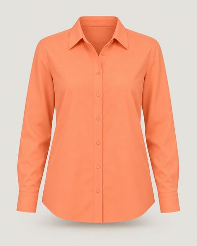 ShirtPapayaAmazon ↗
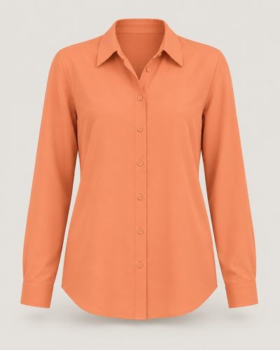 ShirtPeach BloomAmazon ↗
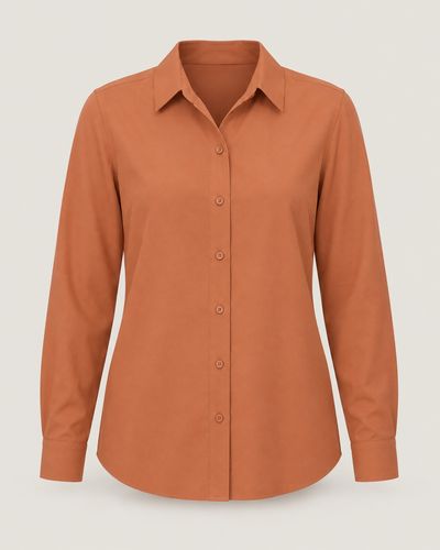 ShirtWarm TerracottaAmazon ↗
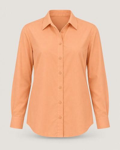 ShirtMelon SorbetAmazon ↗
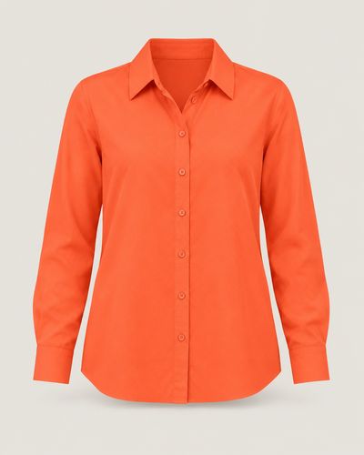 ShirtVivid CoralAmazon ↗
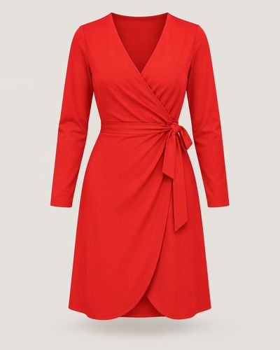 DressClear Warm RedAmazon ↗
The photo shows the colour and the cut, not the product the search finds.
Tips
- Coral and navy is the easiest smart pair: the navy calms the coral down and the coral warms the navy up. Bright Spring wears vivid coral or papaya with a true navy; Light Spring peach bloom with marine navy; Soft Autumn warm terracotta with a soft marine navy or dusty denim blue.
- Coral and turquoise sit almost opposite each other on the colour wheel, so together they look like summer. Bright Spring wears papaya with bright aqua; True Spring melon sorbet with clear turquoise; Light Spring peach bloom with spring turquoise; Soft Autumn warm terracotta with a muted teal.
- With coral, choose warm neutrals over stark white and black. Bright Spring pairs it with bright ivory, clear camel or warm taupe; Light Spring with warm ivory, oat cream or light camel; Soft Autumn with warm oyster white, soft beige or camel. Gold jewellery suits coral better than silver.
- For a fresh, sunny outfit, put coral next to yellow or green. Light Spring wears peach bloom with butter yellow or fresh leaf; True Spring melon sorbet with honey wheat or grass green; Bright Spring papaya with bright golden yellow or a light chartreuse.
- If coral is hard near your face, choose its cool counterpart: the same liveliness, with blue in the pink. True Summer has soft raspberry, Light Summer rose petal, Bright Winter hot cerise, True Winter magenta fuchsia and Deep Winter cranberry rose. True Autumn and Deep Autumn take the warm, deep road instead: burnt sienna, brick clay, deep pumpkin.
- Not sure coral is yours? In daylight, hold something coral and then something raspberry pink under your chin. If coral makes your skin glow and your eyes look warm, it is yours. If it makes your skin look reddish or sallow while the raspberry looks fresh, wear coral lower down: a skirt, sandals, a bag.
How to find your palette
Colour analysis reads three things in your colouring: warm or cool, light or deep, clear or soft. The quiz asks about your eyes, hair and skin, looked at in a mirror by a window in daylight. It never photographs or scans your face, and the palette it finds is yours to keep.