Colour analysis
Bright Winter or True Winter?
This is your palette
The difference is depth: one palette is lighter, the other deeper. Temperature and clarity are the same.
How to tell them apart
- Compare your hair and your skin in daylight: the deeper the two are together, the deeper the palette that carries you.
- Hold a pale grey and then a charcoal near your face: the one that sits quietly is closer to your depth, the other either swamps you or washes you out.
- Look at a black-and-white photograph of yourself: if it reads mostly light, start with the lighter palette.
Side by side
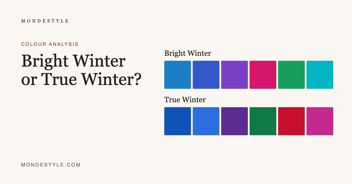
Bright Winter
cool, mid-toned and clear
Cool-neutral, mid to deep, and very clear. High contrast is correct here, and pure white and true black are genuinely yours.
- Clear Cerulean
- Royal Blue
- True Violet
- Hot Cerise
- Emerald Green
- Vivid Turquoise
- Best whiteOptic WhiteBest white for you, and one of very few seasons that can say so.
- Best darkTrue BlackYour best dark neutral – and here that really is black.
True Winter
cool, deep and clear
Cool, deep and clear. Blue-based throughout, with real black and real white as working neutrals rather than as a last resort.
- True Blue
- Cool Cobalt
- Royal Purple
- Emerald Green Deep
- Cherry RedBlue-based red, never tomato.
- Magenta Fuchsia
- Best whitePure WhiteBest white for you. Optic white, and it is correct.
- Best darkJet BlackYour best dark neutral – one of the few seasons for which it is.
Save this palette
How to find your palette
Colour analysis reads three things in your colouring: warm or cool, light or deep, clear or soft. The quiz asks about your eyes, hair and skin, looked at in a mirror by a window in daylight. It never photographs or scans your face, and the palette it finds is yours to keep.