Colour analysis
Bright Spring or True Spring?
This is your palette
The difference is depth: one palette is lighter, the other deeper. Temperature and clarity are the same.
How to tell them apart
- Compare your hair and your skin in daylight: the deeper the two are together, the deeper the palette that carries you.
- Hold a pale grey and then a charcoal near your face: the one that sits quietly is closer to your depth, the other either swamps you or washes you out.
- Look at a black-and-white photograph of yourself: if it reads mostly light, start with the lighter palette.
Side by side
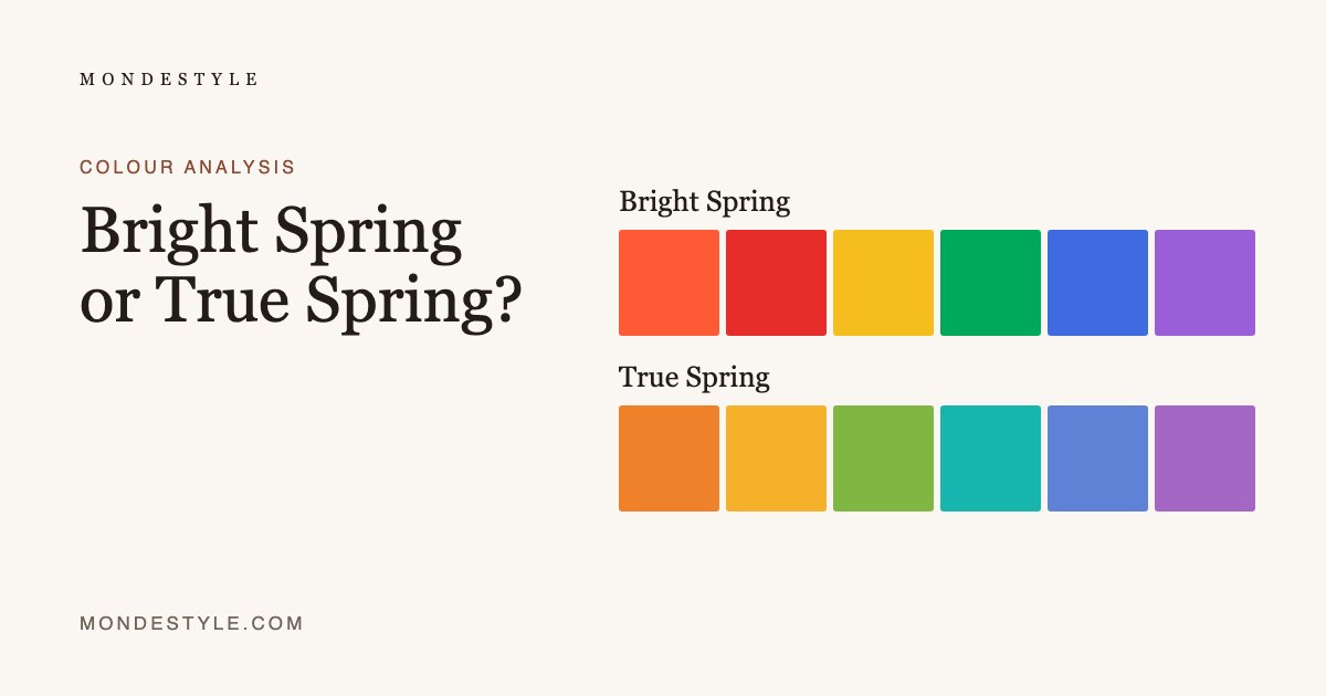
Bright Spring
warm, mid-toned and clear
Warm-neutral, mid-toned and very clear. High contrast is the point; muting anything here kills it.
- Vivid Coral
- Clear Warm RedTomato red, not blue-red.
- Bright Golden Yellow
- Emerald Bright
- Bright Warm BlueYour blue. Royal, with warmth under it.
- Bright VioletClear violet – the region the old palette could not reach.
- Best whiteBright IvoryBest white for you. Bright, with the barest warm cast.
- Best darkDark ChocolateUse instead of black. Warm enough to sit beside your gold.
True Spring
warm, light and clear
Warm, clear and golden. Everything is lit from inside; nothing is greyed.
- Golden Poppy
- True Marigold
- Grass Green
- Clear Turquoise
- Warm CornflowerYour blue. Warm-based, so it sits beside gold.
- Spring AmethystViolet with warmth in it – not the cold plum of Winter.
- Best whiteIvory SilkBest white for you. Warm and soft, never chalky.
- Best darkEspresso BeanUse instead of black. Your best dark.
Save this palette
How to find your palette
Colour analysis reads three things in your colouring: warm or cool, light or deep, clear or soft. The quiz asks about your eyes, hair and skin, looked at in a mirror by a window in daylight. It never photographs or scans your face, and the palette it finds is yours to keep.